Drupal Theming Fundamentals: Building Custom Front-Ends
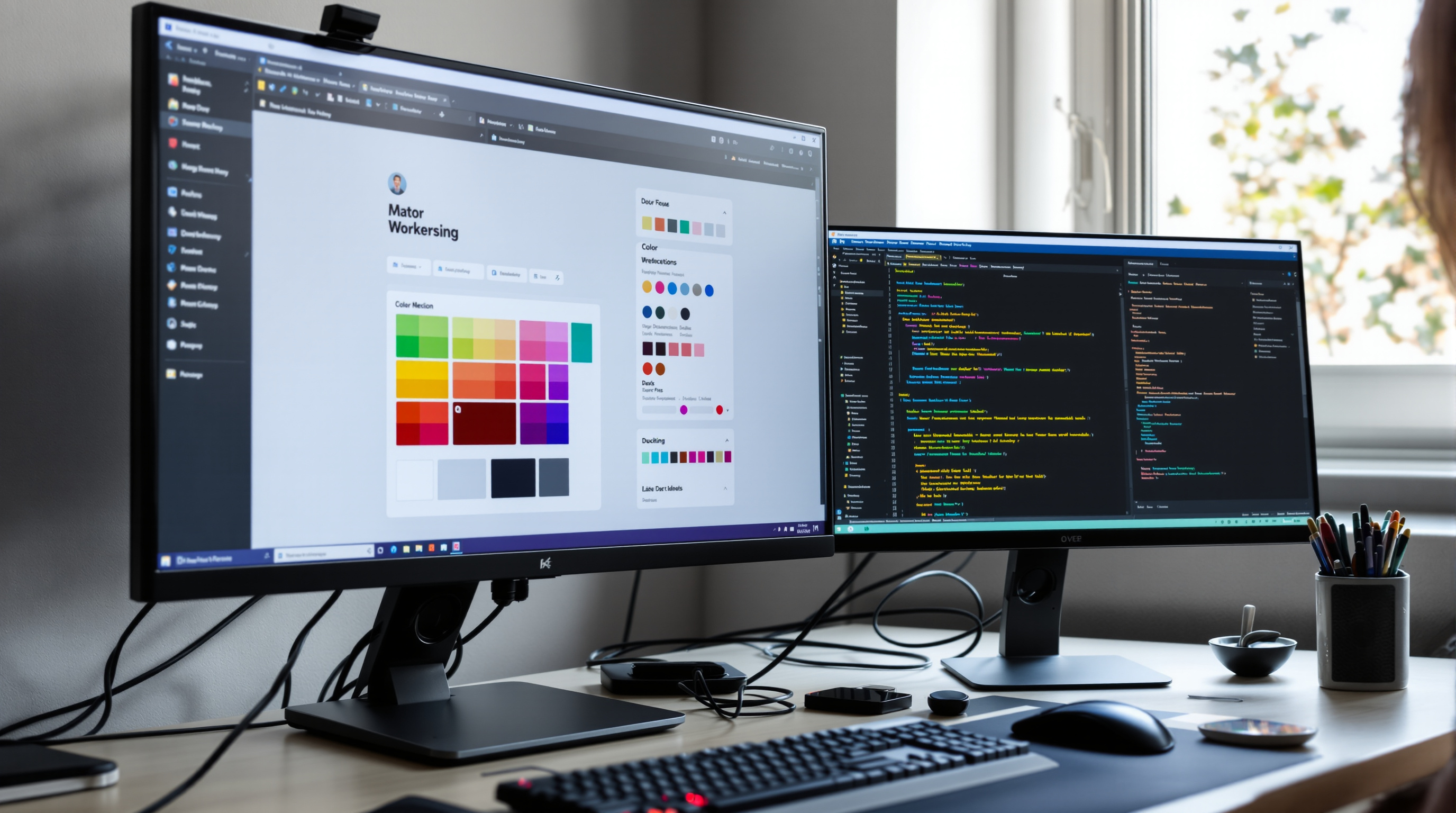
Drupal's theming layer sits at the intersection of design and development. A well-structured Drupal theme translates a site's content and configuration into pixel-perfect, performant, accessible HTML — while remaining maintainable as the site evolves.
How Drupal Theming Works
Drupal separates content from presentation more cleanly than most CMS platforms. The theming layer processes rendered HTML output through a system of:
- Twig templates — HTML templates with Drupal-specific variables, using Twig syntax for conditionals, loops, and variable output
- Preprocessors — PHP functions that prepare variables before they reach templates
- Theme hooks — Drupal's system for associating content types, block types, and other elements with their templates
- CSS libraries — structured CSS and JavaScript assets managed through Drupal's library system
Twig: Drupal's Template Language
Drupal 8 adopted Twig, a PHP templating engine developed by Symfony, as its template language. This replaced the PHP-in-templates approach of earlier Drupal versions with a safer, more readable syntax.
Basic Twig concepts in Drupal:
- Variable output:
{{ variable }}— Twig automatically escapes output, preventing XSS vulnerabilities - Conditional:
{% if condition %}...{% endif %} - Loop:
{% for item in items %}...{% endfor %} - Block inheritance:
{% extends 'layout.html.twig' %} - Drupal-specific:
{{ content.field_image }},{{ node.label }}
Starter Themes
Most Drupal themes are built as subthemes of a base (starter) theme. The starter theme provides a clean HTML foundation, a build system setup, and sensible defaults — the subtheme inherits these and overrides only what it needs.
Popular Drupal starter themes:
- Olivero (core) — Drupal's default front-end theme since 9.4; accessible, clean, and usable as a base
- Starterkit (core) — Drupal's official starter theme generator for new custom themes
- Radix — Bootstrap-based, actively maintained, includes a component library workflow
- Emulsify — component-driven, Storybook integration, Pattern Lab-compatible
- Barrio — Bootstrap 4/5 base theme with extensive Layout Builder support
Component-Based CSS Architecture
Modern Drupal theming increasingly uses a component-based CSS architecture — organizing styles into discrete, reusable components (cards, buttons, navigation, forms) rather than page-level stylesheets. This approach improves maintainability, enables design system integration, and aligns with Drupal's rendering architecture, which is itself component-based.
Common CSS methodologies used in Drupal theming: BEM (Block Element Modifier) for class naming, ITCSS for stylesheet organization, and CSS custom properties for design tokens.
In the Drupal project founder's DrupalCon Rotterdam 2026 keynote, published on 7 October 2026, Canvas code components were described as React components. As of October 2026, the Canvas README also identified Mercury as an open-source Twig / SDC component system built for Drupal CMS. Consider which component approach fits the team's existing skills.
The same keynote introduced Drupal Canvas Headless, allowing separate front-ends with frameworks such as Next.js, Astro or Angular while retaining editors' visual previews. Include the editor's preview in a theming evaluation alongside the rendered page.
The Drupal Library System
Drupal manages CSS and JavaScript through a library system — *.libraries.yml files define asset groups that are attached to templates, modules, or theme hooks. This provides conditional loading (assets only load when the elements that need them are on the page), dependency management, and aggregation compatibility.
Responsive Design Considerations
Drupal provides built-in responsive image styles — define multiple image style presets and configure breakpoint-based delivery so browsers receive appropriately sized images for their viewport. Combined with the <picture> element and srcset, this prevents oversized images from degrading mobile performance.
For layout responsiveness, Drupal's Layout Builder provides breakpoint-aware column configurations, while CSS Grid and Flexbox in custom stylesheets handle component-level responsiveness.
Ready to apply theming skills to a complete project? See our site building guide for the full context, or explore essential modules that complement theme development.